
Photo by Ed Clark
Image Source: http://www.thegreatleapsideways.com/?p=209
After
viewing Ed Clark’s “Going Home” image, I was overcome with sadness when looking
at the face of the Navy officer. When looking at this photo, the first thing
that I saw was the Navy Officer who had tears running down his face and he
looked as though he might be playing a sad tune. When you look at the other
people in this photo, they all look depressed and sad. No one is smiling and
most of them have their heads down, as if they are praying. This photo sets a sorrowful tone, therefore leading me to
believe that something tragic has happened, which has personally affected all
of these people. The title of this image “Going Home” makes me think that the
Navy officer is playing a song for someone who has died, and therefore “is
going home” to heaven. Everyone in this photo looks as though they are mourning
the loss of a loved one. To me, this image embodies the exact feeling when you experience
the loss of a loved one and are grieving their death. I think it captures the
raw emotion of how most people respond to death, and I think how I myself might
respond to a tragedy. This image has a lot of emotion in it, and as Patrick
Kiger states in his article, “Words may strive to appeal to the logical portion
of our minds. But the images captured by photojournalists… often take hold of our hearts and reach us on a more primal emotional level.” Ed Clark’s image really pulled at my heart
strings and made me feel sad for the Navy Officer, even though I have never met
him. Ed Clark was able to capture a group of people in such a fragile state, allowing
us to see how different people react to tragedy and loss.
Obvious Main
Subject
In
this picture, the viewer can tell that the focus is on the Navy officer, for he
takes up about 2/3 of the image area.
Although there are still other people in the background of the picture,
my eye is drawn towards the Navy officer because he is the biggest and is the
most expressive. By having the Navy officer be the obvious main subject, it
leads the audience to believe that something sad has occurred because the photo
captures the Navy officer’s raw emotion.
Subject’s Expression
In this image, you can clearly see the subject is
experiencing sadness, as tears stream down his face. He continues to play a tune,
although the audience can clearly see that the main subject is overwhelmed with
grief and sorrow. He looks as though he is mourning the lose of a loved one and
the sorrowful expressions from the people in the background, add to the main
subject’s expression of pain. This image does a great job capturing the raw
emotion of human sadness and embodies the reaction that most humans would have
if they lost someone close to them.
Black and White
This image of the Navy officer was shot in black and
white, making the photo look iconic and timeless. If the photo was not in black
and white, I think that the color would take away from the subject. Being in
black and white, it makes the image look more dramatic, especially the way the
main subject looks. The black and white gives this photo a more depressing
tone, which is fitting.
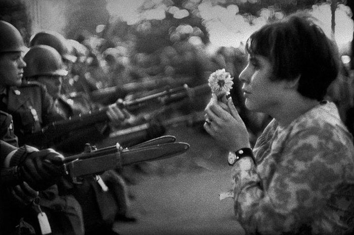
Photo by Marc Riboud
When I first saw this image, I was intrigued by it
because although it is so simple, it conveys such a powerful message. The
image, to me, shows how people have to make the choice between peace or war in
the face of a crisis. There are many ways to view this image and as Shahidul Alam
says in the video, “a story has many truths, at many levels, and it needs to be teased out and seen and dissected and analyzed from different levels.” This image represents a sense of truth to me
because no matter what a person does, there is always going to be two sides to
an argument. People have to decide whether to fight using violence, or fight
using their words. I think I liked this image a lot because it shows the two
extremes of truth when it comes to dealing with an issue. No matter what culture
you are from, the truth is that at some point or another, you are going to have
to decide which extreme you are going to pick. This picture has many layers, in
which the girl holding the flower could represent the innocence and peace in
the world, while the armed solider represents all the violence that the world
has seen. Everyday, peace is in a constant standoff with violence, which is
represented in this image. Everyone has their own bias about a situation, but
as Professor Nordell states in his video, “Truths can essentially change over time.” As we grow older and become more aware of the situations at hand, we have
to take a hard look at the choices, or truths, we are given, and make a
decision. When looking at this image, I employed emotion/ intuition to
determine that this image represents truth. When thinking about how people deal
with a situation, there are a variety of different ways people could go about
it. However, I feel that the two main ways would be peacefully dealing with it
or violently handling it. I believe that this image represents those two ideas
and how there is a fine line between these two extremes.
In this picture, there is a shallow depth of field, where
the subject is very close to the camera and is in perfect focus. Since the main
subject is so close up, it allows the viewer to focus all the attention on both
the girl holding the flower and the bayonet, for those are the most important
parts of the image. By the photographer using a shallow depth of field, it
allows for the background to be blurry and out of focus, really drawing our attention
to the front of the picture.
Keep It Simple
Although this picture is very simple, it sends a powerful
message that people should choose peace and love, over war and hate. There is not
really a lot going on in this photo, but by having the girl hold the flower in
front of the armed men, it shows how we need compassion and understanding,
rather than violence. By having the image of only one protestor going up against
the armed men, it shows how fearless one person can be when they stand up for something
they believe in. If the photo had more protestors, I do not think the image
would have the same effect.
Rules of Thirds
In this image, the young woman is positioned
all the way to the right, drawing the audience’s attention towards the main
subject, and then towards the center, to where she is holding the flower. Since the main subject is on the right side
of the image, it makes the viewer want to look at the rest of the image to find
out who she is confronting. I think that by having the main subject not centered,
it engages the viewer more and creates a nice balance between the flower and the
weapon. By having the subject positioned on the right, we can also focus on the
subject’s environment and the other minor subjects around her.

Photo provided by Alamy Gallery
This is an image of Adolf Hitler during one of his
rallies, where he is interacting with the audience and speaking to a little
girl. If someone were to look at this image and have no background knowledge about
who Hitler was, they would probably think that this was a great, lovable man
who was an inspiration to all. However, I believe that this image does not
represent the truth because it depicts Hitler as a kind soul who is nurturing,
instead of a ruthless leader who organized and executed a mass genocide. Photojournalists,
as the Majority World agency explains on their website, are supposed to be “opening minds -challenging perceptions and providing new sources of inspiration and insight.” People have their own bias
when it comes to decision making, especially deciding whether a person is good
or not. The photojournalist who captured this shot wanted to show the world the
softer side of Hitler. As Donald Weber states in the article, “Photographers choose where their frame goes. They
selectively choose what the audience will see, will believe.” So
the truth for this photographer was that Hitler was not such a bad guy and was
liked by everyone, especially children. However, I believe that this image gives
a false representation of Hitler’s personality and everything he stands for,
and therefore does not represent truth. When looking at this image, I employed logics/reason
to determine that this image does not represent truth. I used information that
I previously learned about Hitler to decide that he was not such an angelic and
nurturing man, even though he was depicted like that in the picture.
Quality of Light
When
looking at this image, the light seems to be drawn towards the child and
Hitler, pulling the viewer’s attention toward both of them. The child looks
really bright in this image, which could represent her innocence. There is a
good balance between the amount of light on the child and the amount of light
shown on the men. Since the men are shown in a darker light, it really draws
your attention to the child and Hitler, which are the main subjects.
Background Detracts from
Composition
In this image, the background full of people seems to
distract from the main subjects. There is a lot going on in this image, especially
when looking at the faces of the men in back of Hitler. I think that by having
all of these people in the image, they are competing for attention with the
main subjects. The little girl seems to blend in with the men standing behind
her.
What Feelings
Does the Image Create?
When looking at this image, it makes
me feel as though Hitler is a nurturing man, who is kind and lovable. Hitler is
portrayed as being liked by children and seems to really enjoy talking to them.
In this image, Hitler looks like a hero that the children adore and look up to.
This image captured my attention because I have never seen Hitler behave in
this way and it makes him look like a compassionate human, instead of a
ruthless dictator.
No comments:
Post a Comment